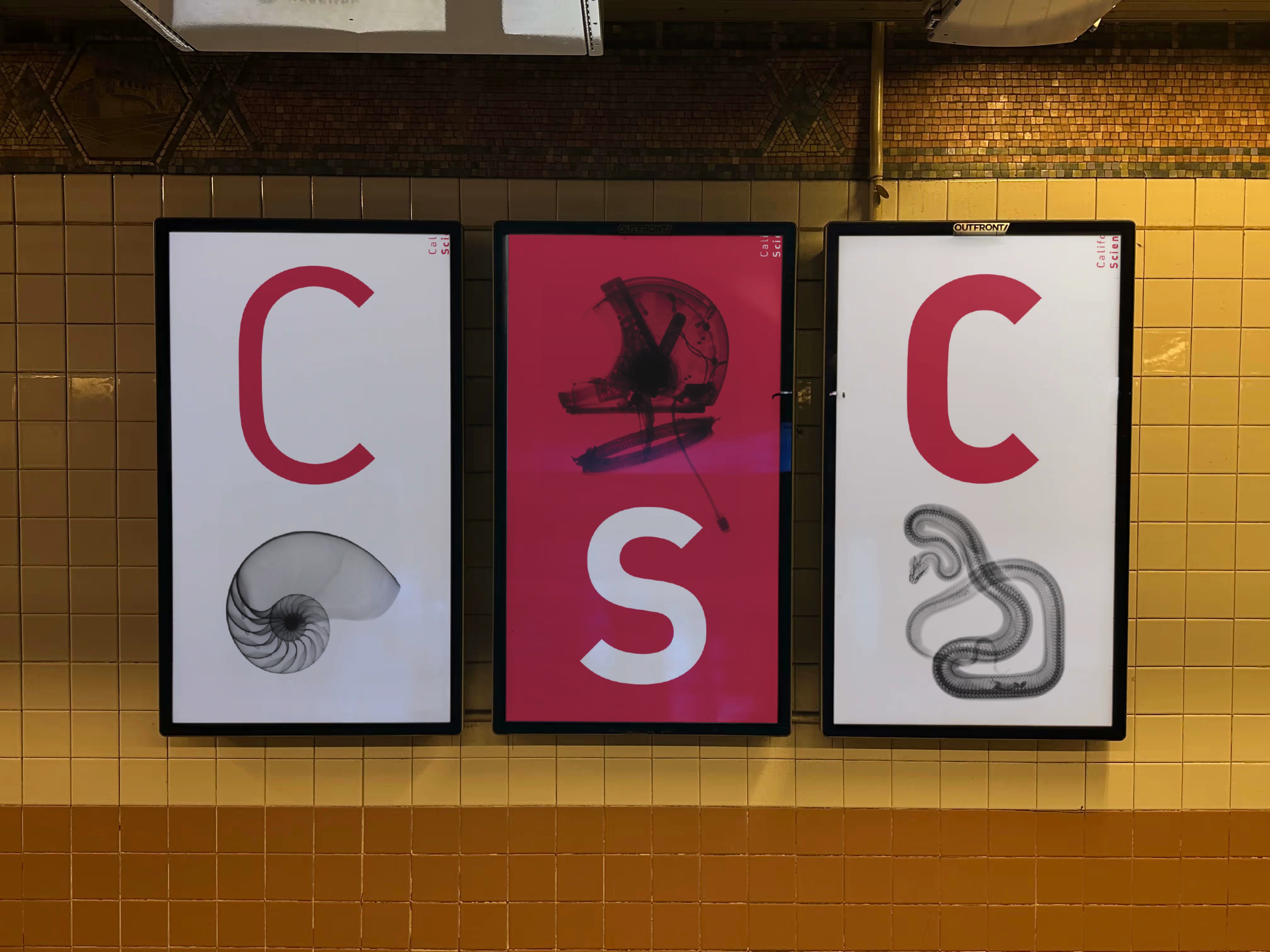
The visual identity of the California Science Center captures its dynamic spirit, making it instantly recognizable and setting it apart from other museums. It embodies a modern, versatile space where curious minds of all ages can explore, learn, and be inspired. This vibrant identity invites visitors to experience science in a way that's engaging, fun, and accessible to everyone.
Client
California Science center
DELIVERABLES
Photography Branding
Year
2016
Role
Creative Direction


Design strategy
The California Science Center speaks to an unusually wide audience: young children on school trips, families, and adults who come back for deeper exhibits. The identity had to feel playful enough for the first group and credible enough for the last, while standing apart from every other museum competing for the same weekend. My strategy was a single metaphor that scales across all of them: the X-ray, revealing what's hidden beneath the surface. It is simple enough for a child to grasp and rich enough to carry exhibits on microscopic biology and ecosystems. One idea, applied consistently, made the brand instantly recognizable and gave every exhibit a shared story about curiosity and discovery.



Institution research
The Science Center’s rebranding draws on the metaphor of X-rays revealing hidden worlds beneath the surface. This idea shaped both design and storytelling, emphasizing that science is about uncovering the vibrant systems behind everyday life. Exhibits like “World of Life” and “Ecosystems” reflect this, exploring microscopic biology and the interdependence of natural systems. The X-ray metaphor became a symbol of curiosity, transparency, and discovery core to the Center’s mission to illuminate the unseen forces shaping our world.